

Uplight has historically used predefined comparison groups of similar homes to help a customer see how their energy use compares with other homes in a widget in Home Energy Reports (HERs), eHERs, and customer portals. The Uplight Product Design team is continually conducting user research to continue to improve the customer experience.
The comparison model we currently use predicts a customer’s hypothetical average and efficient usage based on similar homes with the same attributes. We wanted to determine the best way to communicate this information: either the fixed model or one where we compare customers to themselves.
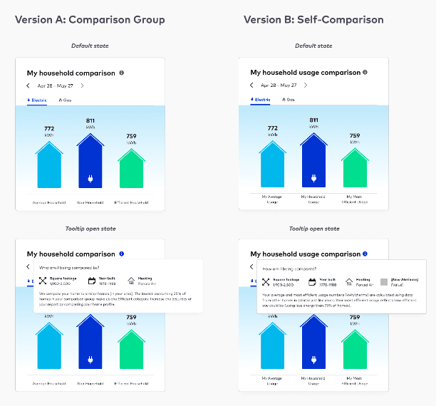
We conducted A/B tests with 12 energy users to understand how they interpreted the Similar Home visual on a HER and what was more effective–the framing of similar homes comparison group or a customers’ own self-comparison.
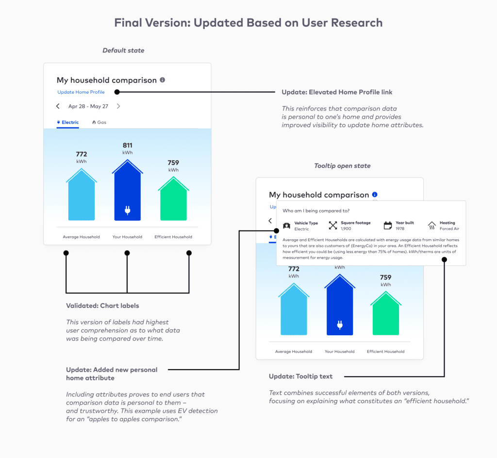
The updates to the self-comparison module included:
- The addition of “usage” into the widget title
- The ability to add a new attribute at end of list in tooltip such as EV ownership (using EV detection)
- Chart labels focused more around self-comparison such as “My Average Usage” versus “Average Household”
The verdict: Customers liked bit of both
When asked which version of the above they preferred, users liked parts of both versions, and to our surprise, wanted to combine them. They appreciated the clear labels on Version A (the fixed comparison), and found the self-comparison in Version B to be more accurate with the personalized attribute named (such as owning an EV or having solar). Seeing it on a chart enabled them to better trust the data as they thought they were seeing an “apples to apples comparison.”
What didn’t work? Some found the self-comparison language to be disorienting. And customers had questions about the time scale for “My Average Usage” and “My Most Efficient Usage,” especially on Version B.
About a quarter of customers wanted tips within or around the comparison widget on “how to become an efficient household” and were motivated to join the group with lower usage behavior–providing an opportunity to surface actions that customers can take to save energy.
And based on the user feedback, we made changes to the language and titles (see the specifics below), adding the ability to add attributes to continue to improve the customer experience. This widget can be seen in our eHers, HERs, and on the customer portal, creating consistency across touchpoints.