As we brought together some of the leading companies in the energy efficiency and utility customer engagement space, including Simple Energy, Tendril, FirstFuel, EnergySavvy, and EEme, we knew we needed a name and a brand that would speak to who we are and our collective impact.
In this new company we are deeply committed to serving our utility partners and to accelerating the clean energy ecosystem. Our name needed to emphasize this passion, while also spotlighting our partners and our customers–those who we support in creating this energy transformation. We also needed a name that was approachable, simple, and aspirational. For all of these reasons, we chose Uplight.
Uplight speaks to the power of our industry: a power that, when harnessed and directed, can drive massive change at a critical time in our history. We are inspired by the impact our utility partners have already had in reducing carbon emissions and we will continue to support and accelerate their journey along the path to a carbon-free energy system. The name Uplight demonstrates how we can shine light onto our utility partners and their customers, to better highlight their efforts and impacts. Uplight is also about upward movement and growth. We relentlessly pursue the change that is needed in the world.
When looking for a name, we needed something that was simple and understandable. It needed to be accessible and easy to say, while also speaking to the inspiration and meaning of our company. While “uplight” is, in fact, a common English word, it is also the combination of two of the most basic words in the English language: Up and Light.
Finally, we needed a name that could be ours. It had to be something truly new – not representing any of the companies or people who have come together to form this new endeavor – while also not weighed down with any connotations or baggage in the minds of those who hear it. In Uplight we found that: a new name that we could define.
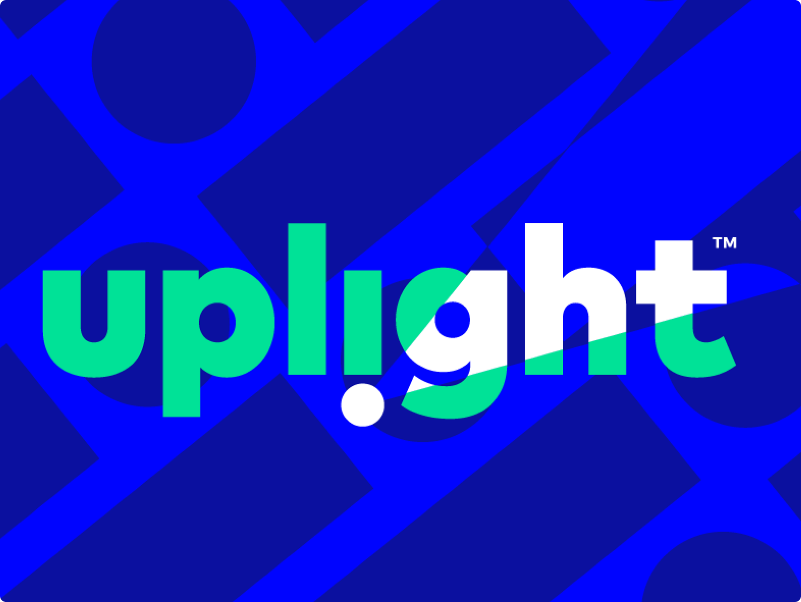
The Uplight logo also embodies this excitement of individuals uniting and charting a path to a clean energy ecosystem. Much like other enterprise-facing companies, we don’t have a separate mark, icon, or logo–instead putting our name first. Our colors are vivid and bright–signifying innovation and approachability, not a color palette for a boring enterprise software company. By flipping the “i” in the logo and using it to cast a light upward, we’ve challenged the status quo. Also, by rotating the “i” in Uplight 180º, the “i” becomes an exclamation point–illustrating our passion and excitement. Finally, the bright green light in the forward–up and ahead.
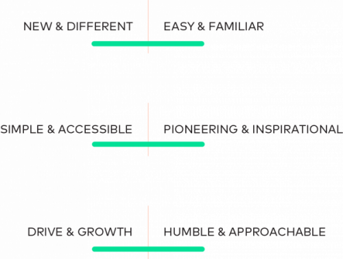
For that task, for those three sets of (sometimes) conflicting priorities illustrated in the below image, we think we’ve found the perfect name: Uplight. We are new and different AND easy and familiar at the same time; we are simple and accessible AND pioneering and inspirational; we drive and growth AND are humble and approachable.
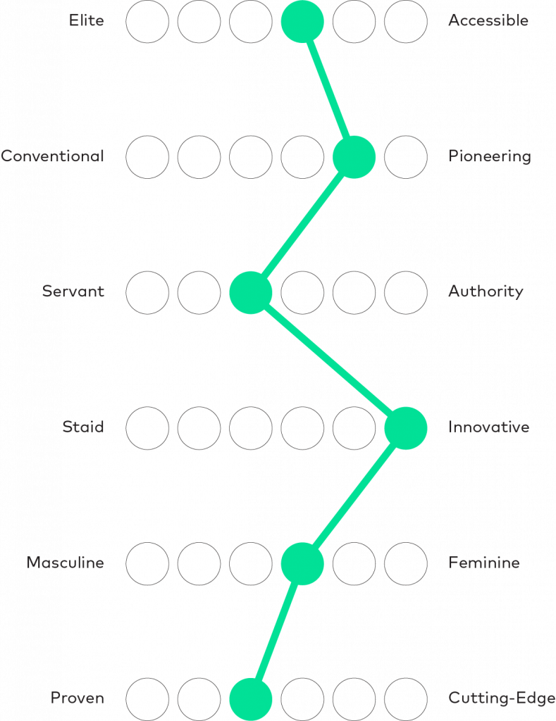
Uplight is warm and friendly. While we are experts, we are committed to serving our customers and partners. Our personality is accessible, pioneering, innovative, and proven–shown in the personality sliders below.
We think it’s one that will represent a truly remarkable company, and we hope it endures for years as a case study for the kind of positive change a business can have on the world.
Now, we just need to live up to it. All of us. Let’s go.